
Start with how the sign will be seen
A readable indoor sign starts with the place where someone needs to understand it. Decide where the reader will be, how they will approach, and what lighting or viewing angles are present. Then choose the wording, text height, panel size, font, colors, finish, and placement together.
A larger panel can give a design more space, but panel size alone does not make the words larger or easier to read.
- Is it a nameplate read from across a desk?
- Is it mounted on a door and read while someone approaches?
- Does it need to be noticed from across a room or down a hallway?
- Will furniture, a counter, or another obstruction keep people from walking closer?
- Will people usually see it straight on or from an angle?
- Could overhead lighting or a nearby window reflect across the sign?
Measure both the available display area and the point where the message should first be understood. Those are different measurements: a sign can fit the available space while its lettering remains too small for the intended approach.
Write the message before choosing the panel
Short, familiar wording leaves more room for clear lettering. Use the words people already expect for the destination, instruction, or status.
- Use Reception instead of Please Proceed to the Reception Area.
- Use Employees Only instead of This Area Is Restricted to Employees.
- Use one clear destination on a simple directional sign instead of several unrelated instructions.
Do not reduce the text height merely to preserve words that are not needed. Shorten the wording, choose a larger permitted format, or use a layout designed for separate primary and supporting information.
Choose text height, not just panel size
Choose text height according to when and where the message must be read. Do not infer it from the outside dimensions of the panel.
Where AUP shows text height, it is a physical measurement based on the finished height of a capital I, not the point-size number used by a word processor. An on-screen preview is proportional; use the listed dimensions rather than treating the screen as an actual-size ruler.
For a Standard Sign, start with the recommended formats shown on the product page. Each recommendation pairs a text height, line layout, and panel size. Selecting another allowed panel width or height changes the background around the fixed message; it does not automatically enlarge, scale, or reflow the lettering. Choose a larger text tier when the lettering itself needs to be larger.
Custom Sign Templates also keep panel dimensions and text height as separate choices. Review both. If longer wording does not fit at the desired text height, shorten the message or choose another permitted size rather than compressing the design.
Please Knock in three recommended formats
The current Please Knock sign demonstrates why panel size and text height should be compared separately.
| Recommended format | Panel size | Text height | Layout |
|---|---|---|---|
| Low profile | 10 × 3 in | 0.75 in | One line |
| Balanced | 8 × 5 in | 1 in | Two lines |
| Maximum visibility | 9 × 6 in | 1.5 in | Two lines |
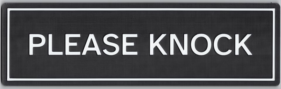
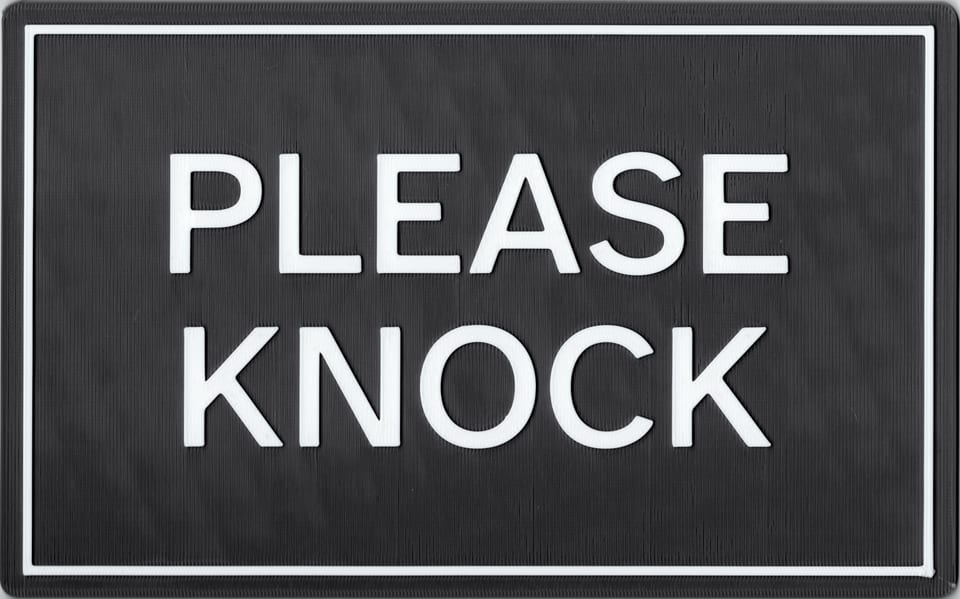
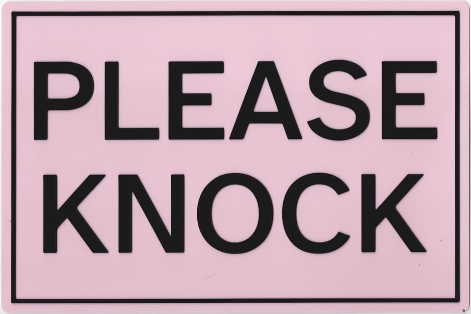
The widest recommendation does not have the largest text. The taller recommendations allow the same two-word message to use two lines and larger lettering.
These formats help compare the product; they do not promise that every person will read a particular size from a particular distance. Vision, font, contrast, finish, lighting, angle, sign position, and surrounding visual clutter all affect the result.
Choose a font that remains clear in context
For a message that needs to be understood quickly, begin with a plain, familiar option such as AUP's Legible or Neutral style where the product offers it.
- Look for distinct letter shapes.
- Avoid strokes that are unusually thin or crowded.
- Keep comfortable spacing between letters and words.
- Create a clear difference between the main message and any supporting line.
A decorative style may suit a nameplate read nearby. It is less useful for a directional, restricted-access, or room-status message that must be recognized quickly. Font choice cannot compensate for lettering that is too small or colors that blend together, so review the complete design rather than the font name alone.
Choose colors and finish together
Readable color selection depends on a clear light-dark difference between the lettering and its background. Light lettering can work on a clearly dark panel, and dark lettering can work on a clearly light panel. Different color names do not necessarily mean that the colors differ enough in lightness for quick reading.
The U.S. Access Board does not prescribe particular sign colors or one universal numerical contrast threshold in the current ADA Standards. For covered visual signs, it requires light-on-dark or dark-on-light contrast and notes that higher contrast generally improves legibility. Varied or textured backgrounds can reduce effective contrast.
Finish changes how light behaves across the sign. A matte or lower-sheen combination is a useful starting point where strong overhead light, windows, or angled viewing may create reflections. A higher-sheen or visibly varied finish can still be appropriate when its appearance suits the product and the sign remains clear in its intended lighting.
Screen swatches and designer previews help compare choices, but they are approximations. Lighting, screen settings, material, finish, and normal 3D-printing variation affect the finished appearance. Review current finishes and photographed references on Materials & Colors.
Check the intended location before ordering
- Mark the proposed panel width and height at the intended location.
- Stand at the normal approach point rather than immediately in front of it.
- Check the straight-on view and the angles from which people will arrive.
- Confirm that the main message is what you notice and understand first.
- Look for glare, shadows, nearby objects, or wall colors that reduce visibility.
- Ask someone who did not help design the sign what they read first.
Do not judge distance readability from a zoomed phone photograph alone. Camera processing, focal length, screen size, and zoom can make lettering appear different from the in-person view.
If the sign identifies a permanent room or may be subject to accessibility requirements, use ADA Sign Information and confirm the requirements that apply to the product, configuration, location, and jurisdiction.
Sources and further reading
This guide uses current AUP product measurements and records together with the U.S. Access Board's Chapter 7 guidance and the International Sign Association's design and placement overview. Exterior and traffic-sign formulas are outside this guide's scope.